NASO Profumi - UI Case Study
Client
Naso Profumi
The Goal
Website UI & UX Design
Industries
Perfume Brand
Date
May 15, 2022
Overview
Originated in the heart of the country, and with distilleries spread across North India, Naso Profumi is one of India’s favourite perfumeries. The team behind Naso, sits at the forefront of niche fragrances in India. Their enthusiasm is apparent, and they have but one clear vision — to encourage innovative thinking and win over supporters of novelty perfumes.
The Goal
While Naso has had its fair share of popularity, their online sales were far from booming. As was the case for most lifestyle brands, the popularity was limited to offline stores, stockists or personal references. Our team speculated the cause of this to be a rather lacking website with less-popular design elements and a less popular user experience. In their defence, until the pandemic hit, the website was not one of their priority sources of revenue.
Thus the goal of the project was to rethink their online strategy and mock-up some possible ways to reinvigorate the Naso website.
The Problem & Our Solution
As mentioned above, the previous website was not doing justice to the brand’s popularity or the vision itself. Our team did a complete analysis of the entire website, created multiple user journeys, and pinpointed where the user experience was lacking the most.
The three major pointers that made us double-down on our solution were:
The Home Page showed no indication that the website was an e-commerce portal and user’s could actually buy the perfumes from there itself.
The Navigation throughout the website was too cumbersome for a regular user to go through. Essentially, the user would find it difficult to reach or even find the pages where the products are showcased, which in-turn would reduce the chances of the user buying the product.
Nowhere on the website was there information about the brand or the history of the brand in general. This, in our experience, is a major attention factor to drive people to read about the brand more, before they go ahead with their purchases.
With all these pointers in mind, the solution was to redesign the entire website.
Design Process
The advantage in the case of Naso Profumi, was the fact that because it was a redesign project, the brand guidelines, colour palette and the logo was well established and thus, warranted no changes whatsoever. However, to make sure the redesigned website didn’t look outdated, our design team worked on the same guidelines and provided tweaks to the same, over multiple discussions with team Naso.
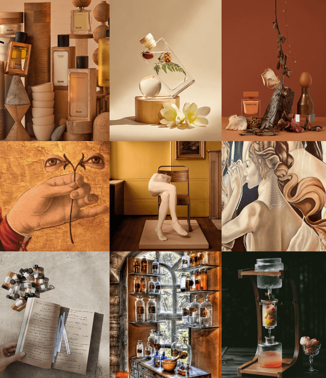
As is with every design project, the first step was the mood board. In this case as well, the mood-board was created in a basic fashion to create a theme for the website’s design. The mood-board captured the essence of the brand’s values and theme on the basis of certain pointers:
Artistic
Earthy
Natural Perfumery
Enfleurage — the science behind extracting fragrances from flowers.
Colour Palette & Typography
The next step was to analyse the brand guidelines and formulate the right colour palette and typographies for the redesign. This job was made easier for us by team Naso, as their colours and typography from their previous website were to be used as it is, for the revamped website. The task however, was to decide the placements for the colours, and choosing the right colour for supporting elements to contrast the brand’s palette.
After thoroughly researching and discussing about the colour palette, our team came to the conclusion that the most suitable colours for the supporting elements would be plain black and white. Since the brand’s colours were too overpowered already, adding another similar colour or adding a colour that would contrast these colours negatively, would not have been the right decision.
Similarly, in the case of typographies, the primary and secondary fonts were also to be used as they were in the previous website. The two fonts that were provided were called Euclid Flex and Edwardian Script ITC. Each had their own set of use cases — Euclid Flex was used as the primary font for textual content such as product descriptions and headings, whereas the Edwardian Script was used for elements that needed to be highlighted without overpowering its surrounding elements, such as for the banner texts.

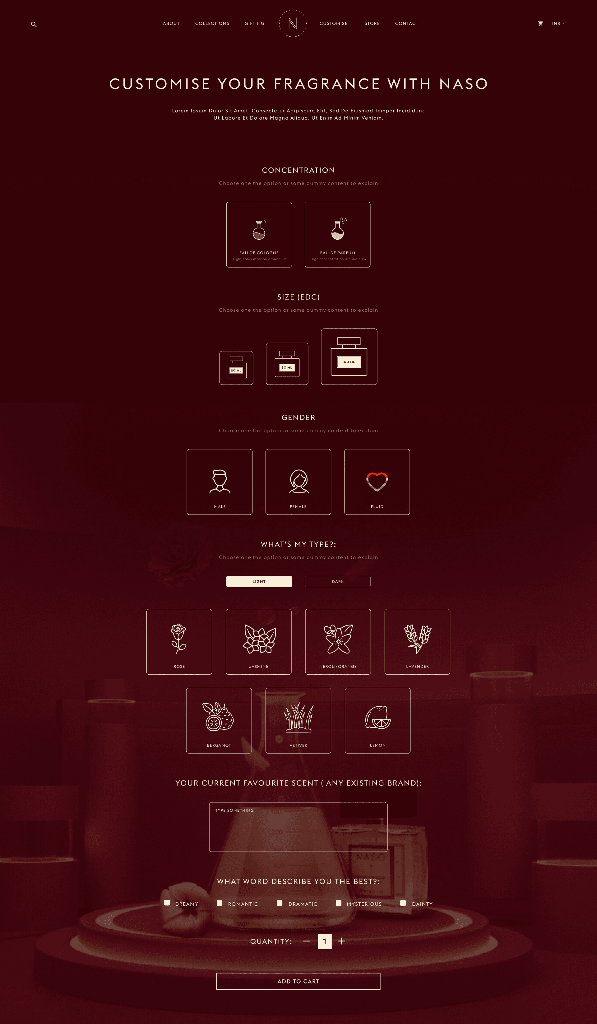
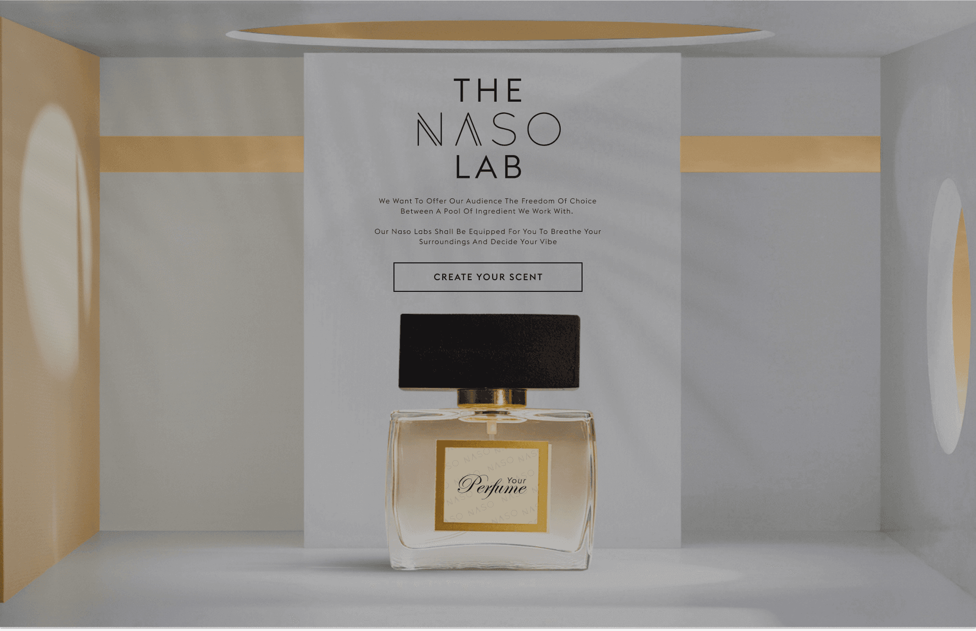
The Naso Lab
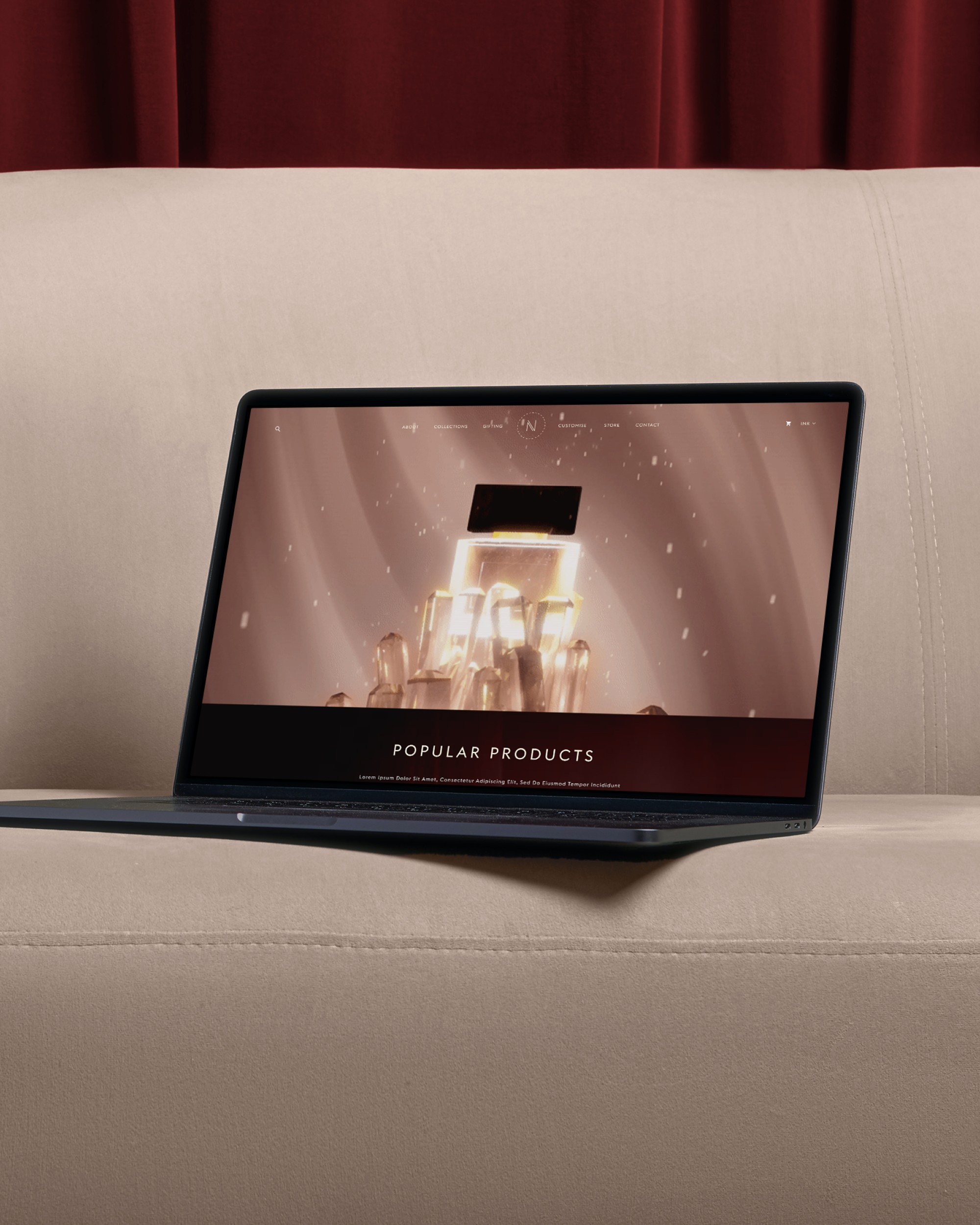
Naso Profumi had one key feature that was different from its direct competitors. The company offered the option of customising or creating a bespoke fragrance based on what the customer likes in terms of ingredients. This was the called The Naso Lab, or TNL. During the design process, this was one of the key elements that had to be taken into consideration. TNL was the flagship service offered by Naso and as such, it needed to be given that much importance on the website, which the previous website did not pay much attention to. Over multiple discussions, it was decided that the TNL would be given a dedicated section on the home page right in the middle of the page, so as to not put it over the products showcase, and also keep it above the other elements such as collaborations. On top of that, a designated page was designed for The Naso Lab, which gave users the customisation options to create their own scent. The Naso Lab section looked something like this.
The Naso Lab page had to be made in a different format, but needed to keep the overall website framework to be the same, to make sure uniformity is maintained. This is what The Naso Lab page looked like.
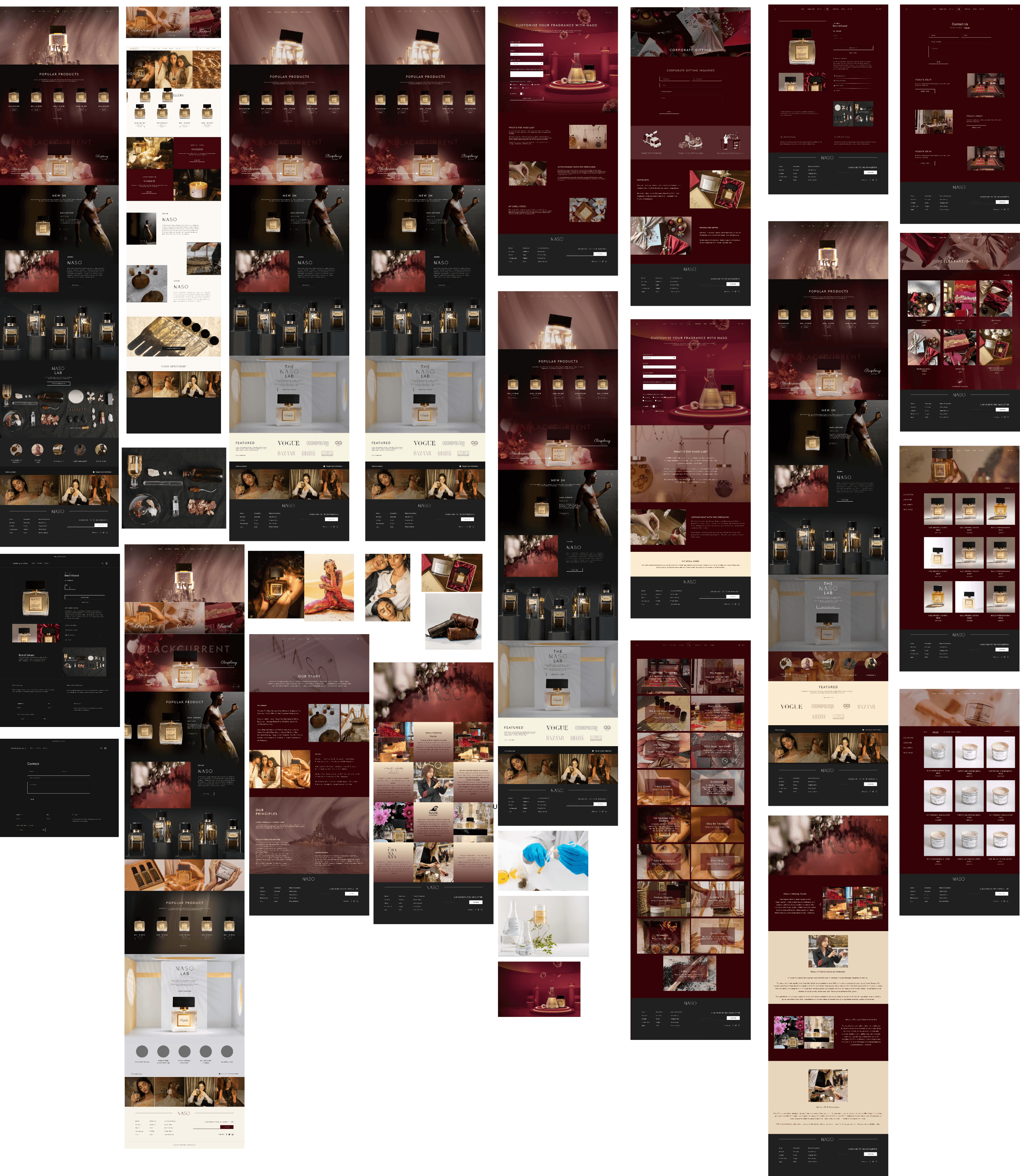
Website UI
Having done with the brand guidelines, colour palette and the typography, the team had all the ammunition needed to begin the process of creation of the website drafts. The first step warranted the search for a general theme and layout on the basis of which would lay the framework for the entire website. Our team created multiple iterations of how he website would look like, in multiple variations of the same colour palette. Some with monochromatic look, while some full of colours and packed with images. Take a look at some of the ideas that our design team formulated before finalising on a single design basis.
Having discussed these drafts with the Naso team, we decided upon the concept based on a dark background in their signature Bulgarian Rose colour, prominent and bold but also sophisticated typography, and the main pattern uniting all the pages and adding creative vibes to the interaction process. The final user interface thus designed captured the elements and the aesthetic of the website in a perfect combination, and looked like this.