Doh Tak Keh - Revamp Project
Client
Doh Tak Keh
The Goal
Brand Revamp Project
Industries
Statement Brand
Date
May 5, 2023
Overview
The global statement wear market has grown up to $185 billion in the year 2021, and will soon engulf approximately 10% of the world’s apparel market. Statement wear apparels are becoming more expensive and difficult to acquire with each passing day. Newer brands are being launched every few months, each with their own theme to increase the chances of gaining popularity over the previous one.
At this growing trajectory, one brand that quickly gained the attention of the masses is Doh Tak Keh. Founded in the heart of the city of Mumbai, DTK is a statement wear brand that focuses on producing garments that takes inspiration from the streets of India. Each print, each product is a blend of art, language, and imagery taken from the lives of everyday folk that live in the country that provides solace to 138 crore residents.
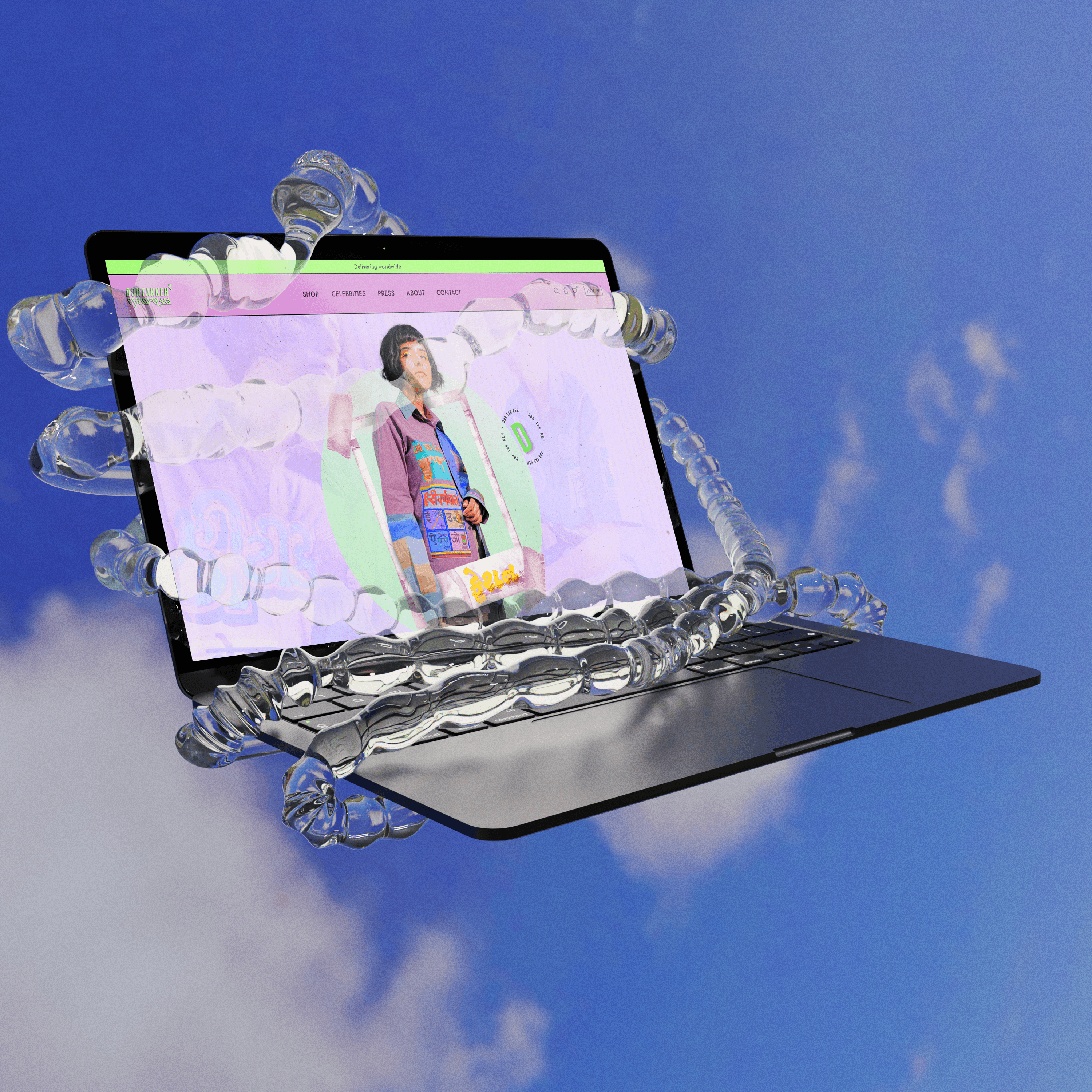
We, at DesignAR, took up the project of redesigning the brand’s website from the ground up and providing a new face to the image of the brand, one that would give justice to the inspiration behind the conception of the brand.
The Goal
With a brand whose website is already being used frequently over the course of its lifetime, recreating it with new ideologies would otherwise be a difficult task. In such cases, the team behind the brand is well accustomed to their current, perfectly working website, and would seldom be open to a lot of change. Fortunately for us, there was not a lot of convincing needed for a complete rework, as the DTK Team itself envisioned a total redesign of their previous website, albeit with some design elements to take over to the new website.
Design Process
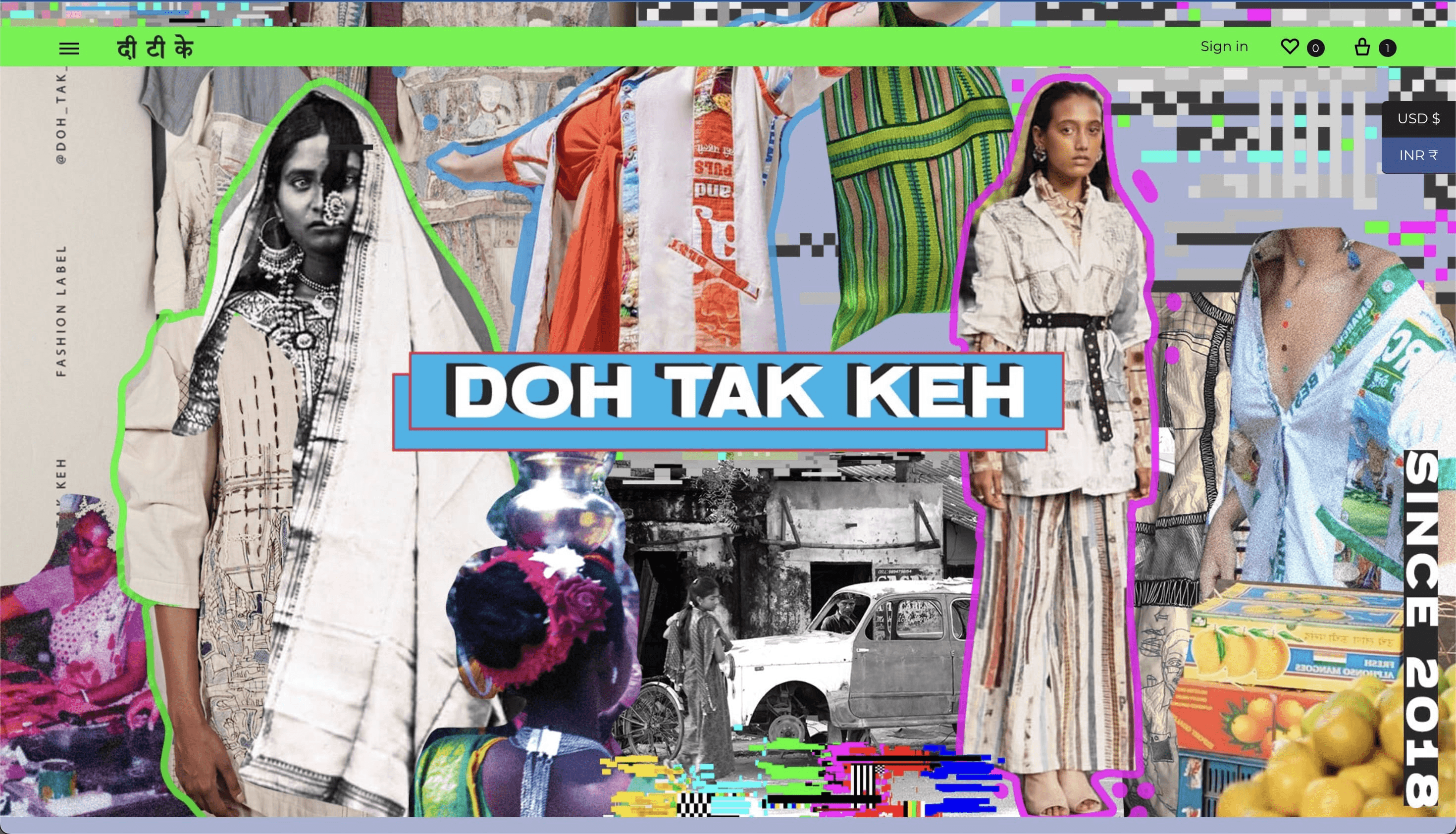
As is with all the design projects, the first step involved multiple hour-long discussions with the team from DTK, as well as a lot of rough, low-fidelity wireframes as to how the website layout would want to be made. Our team also analysed their previous website and researched newer elements that would make the website stand out from others in the same market segment. The previous website looked something like this.
The previous website was, in fact, very well designed and the realisation that it already was unique enough to gain the traction it needed, played a lot on the mind’s of our creative team. This, in all fairness, was truly a challenge for us.
Eventually, as is the norm in all design cases, the next step was to create a mood-board. On researching the brand’s social mediums, story, and taking a look at their garment designs and prints itself, the mood-board was created to capture the essence of the brand that encompassed:
Streets of India
Vintage artwork
Street photography
Murals
Everyday-use items,
Multi-lingual typography; and most importantly
Lots of colour
The creation of the mood-board gave us a clearer idea on which we based the entire design process, and as such, we moved to the next step in the process — the colour palette and typography.

Colour Palette & Typography
Upon taking the decision for the website’s complete rework, the DTK team also gave their brand guidelines a complete overhaul. The colour palette, thus decided, was on the same spectrum of the previously established brand guidelines, but consisted of different shades and some newer colours. Each colour was picked up from their products, logos or Instagram feed’s aesthetic and looked something like this.
The requirements of Team DTK clearly stated that the primary and secondary colours were to be used in abundance on the entire website to give their website the attention that their garments had received. And so, the work could progress with the colours being finalised.
The next step in the process was one of the most important ones for our creative team. In order to perfectly capture the ideology and the aesthetic of the brand, our team came up with the idea to use multi-lingual typography all over the website, in the form of headlines and/or titles. Thus began the process of creating titles for each collection, each category, and each page in a way that could encapsulate this idea and execute it to perfection.
In this process, our team brainstormed over hundreds of permutations to achieve the desired outcome. We played around with different languages used across the country, and in the end it came down to the most common dialect used by the millions staying in this country — Hindi. With this in mind, our team made their way into the creation of the titles.
With the success of our idea with the typography, we had struck off two of the major design elements that were needed in the process of the revamp. Now, all that was left was to pick a signature element to create a monogram for the website.

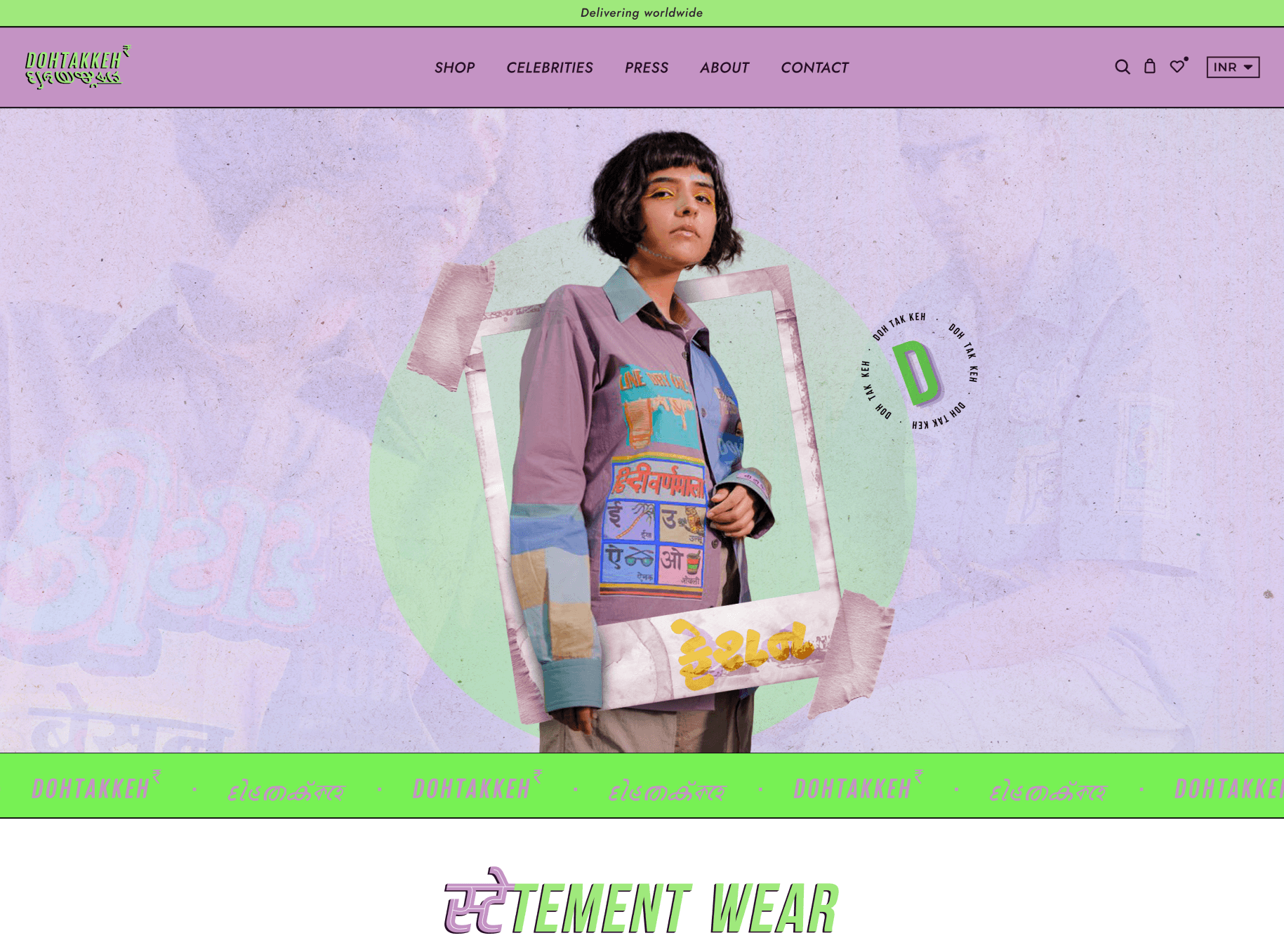
Website UI
The website’s home page is built around the bold theme of the brand which is “Streets of India”. Every element was moulded around this theme and chosen for its proximity to the brand’s aesthetic. Also, a special effect was incorporated on each title to change colours when a user’s mouse hovered on top of it. This made the entire home page more interactive and lively. Another point worth mentioning is the involvement of videos and animated banners on the home page, that worked towards increasing the interactability of the page. These banners were specially created with their products in mind and each banner was given a completely different look to build onto the existing website’s design. Take a look at the animated banners created by our team.


